10 High-Converting Ecommerce Product Page Templates (With 7 Practical Design Tips and Inspiring Examples)

Great product pages are deceptive. They appear so simple and seamless, providing customers with all the information they need and guiding them to the add-to-cart button.
But a lot is going on behind the scenes. It takes hours of design work and weeks or even months of testing to create high-converting product pages.
Next time you land on a product page that strikes you as well-designed, pause for a second. The chances are that nearly every single element – from the color of the CTA to the size of the headline font – has been tested, tweaked, and retested.
Next time you land on a product page that strikes you as well-designed, pause for a second. The chances are that nearly every single element - from the color of the CTA to the size of the headline font - has been tested, tweaked... Click To TweetBut fortunately, you don’t need to spend all that time finding the winning formula. We’ve analyzed some of the top examples on the web. And in this post, we’re going to give you the best practical tips for your online store.
The Anatomy of an Ecommerce Product Page: Essential Elements
3 Out-of-the-Box, Free Templates for Your Ecommerce Product Pages
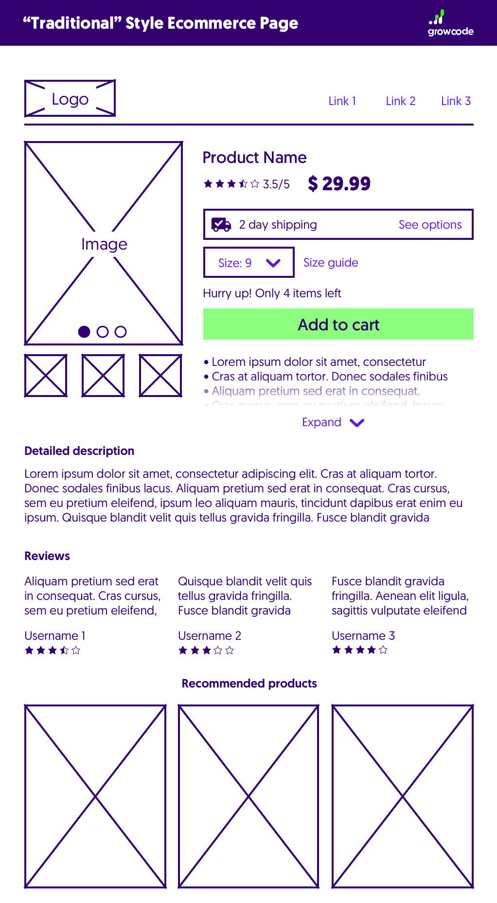
1. “Traditional” Style Ecommerce Product Page Template
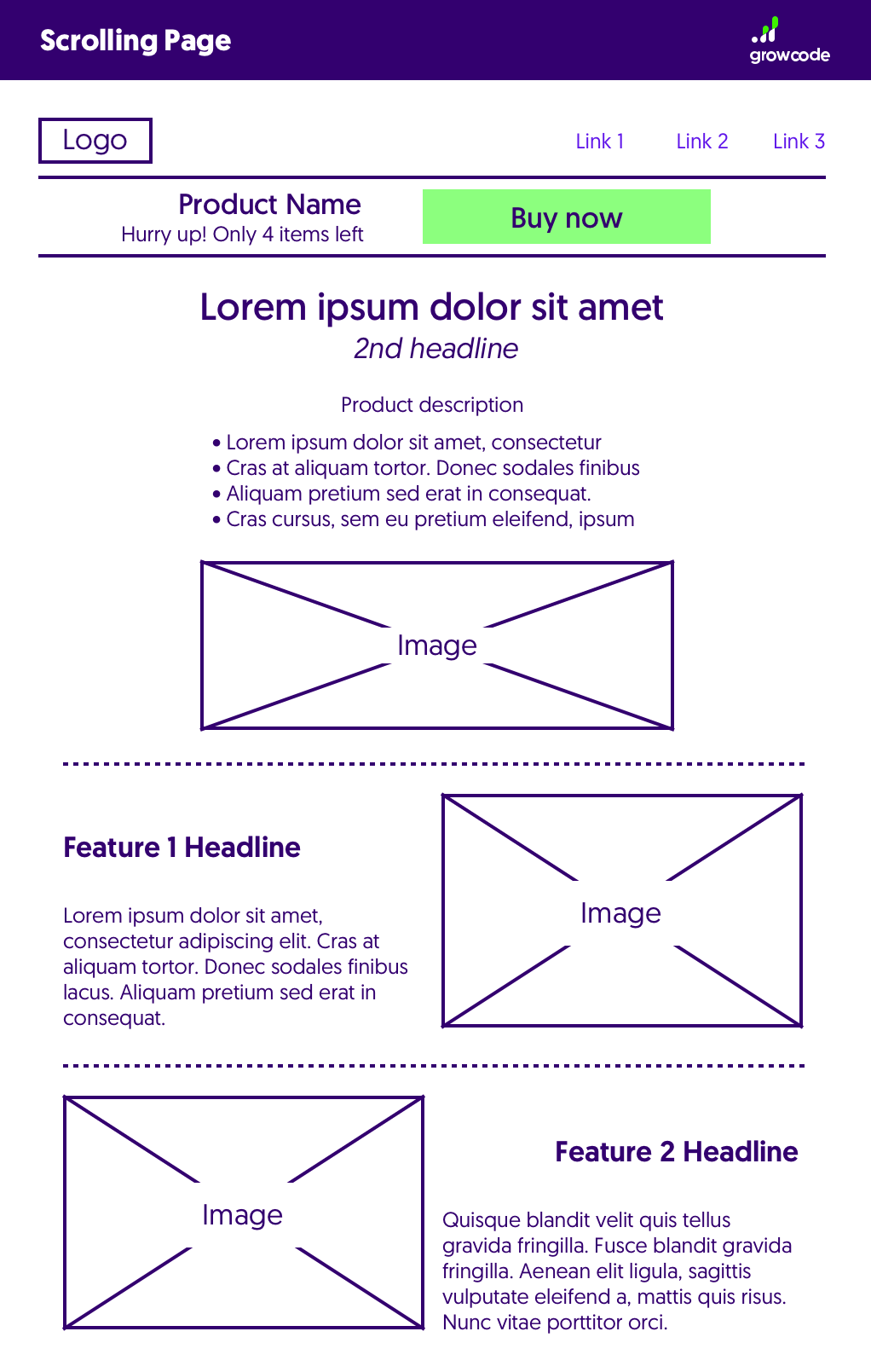
2. Scrolling Product Page Template
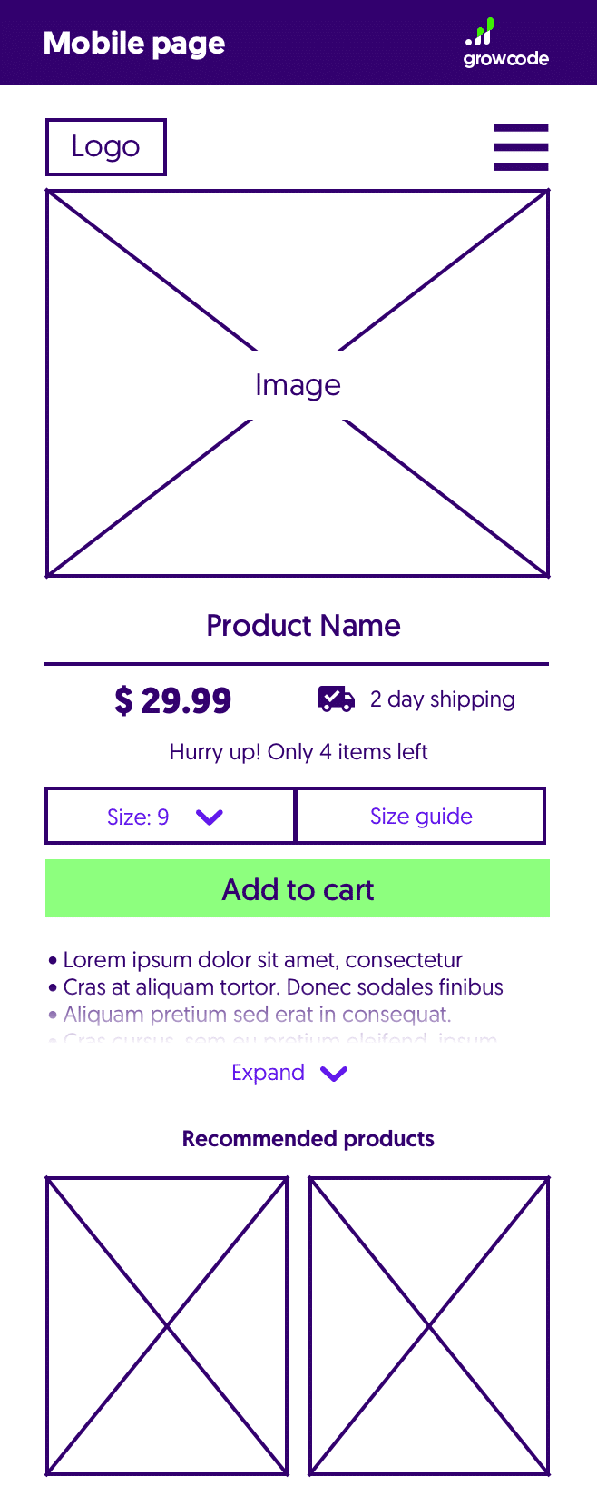
3. Mobile Product Page Template
Inspiration: 10 Examples of High-Converting Product Page Layouts
7 Top Tips for Boosting Conversions with Your New Product Page Template
1. Build Urgency and a Sense of Scarcity
2. Showcase Positive Reviews, Testimonials, Media Mentions and Celebrity Endorsements
3. Ensure Images Are High-Quality and Showcase the Most Important Features
4. Include “Trust Seals” and Payment Options Next to the CTA
5. Limit Unnecessary Clutter Like Social Media Icons
6. Optimize for Mobile
7. Hone Your Copy (Product Descriptions)
Designing a Highly-Converting Product Page Template
Dig in!
Let’s quickly cover the fundamental elements to include on any product page.
These are absolute must-haves and contain the essential information visitors need to make purchase decisions. Every product page on your site should contain them in some form.
The main headline of the page should include the name of the product. The product title should clearly identify the item and distinguish it from other similar products. Let’s say, for example, that you sell Rolex watches on your site. The title “Rolex Daytona Diamond and Ruby Watch Set in White Gold” is far better than “Rolex Watch”.
Product titles will usually include the generic name of the product (skirt, watch, earrings, etc.), a brand name, and any main distinguishing features such as color, size, model type, etc.
Product titles are also important for search rankings and traffic. A well-written and descriptive title will drive a high click-through rate and will rank for a wide number of search terms.
Images should sit next to or immediately above the product description. They’re used by visitors to verify and “inspect” products, checking key features and details.
It’s usually beneficial to include multiple images – covering all angles and showing all features – that are zoomable, allowing potential customers to have as much interaction with the product as possible.
Remember to include images of the exact product, not images for a range of products or similar items with similar specs. It’s also good to add a point of reference (such as a person or a hand) so that visitors can gauge an item’s size.
Product descriptions serve two functions: to inform and persuade. They should give a detailed description of product features. But it’s also important to engage visitors by including secondary information like mentions in media publications, awards, details about the manufacturing process like traditional or ethical methods, and so on.
Like titles, product descriptions are also important for SEO and should include high-volume keywords.
Price should be included immediately below the product title (or as near as possible). This piece of information is one of the most important for buyers and should be shown prominently. If you are offering a discounted or sale price, show the previous struck-through price next to the current one.
Customers will usually choose a model – especially size and color – immediately before buying, so ensure that feature options are displayed in close proximity to the main CTA.
To avoid confusion, clearly state when products are available or unavailable. Showing actual stock levels when a product is limited can increase buyer urgency.
Like price, shipping time and cost is another major factor in a potential buyer’s decision-making process. Uncertainty about the cost and speed of shipping contributes significantly to buyer drop-off, negatively affecting conversion rates.
Price, shipping time and cost is another major factor in a potential buyer's decision-making process. Uncertainty about the cost and speed of shipping contributes significantly to buyer drop-off, negatively affecting conversion rates. Click To TweetAllay any doubts by including shipping information immediately before or after the CTA. If you offer free, same-day, or next-day delivery, say so very clearly.
Your CTA represents your most-desired action. It should be displayed prominently above-the-fold next to the product images. Research suggests that imperative phrases (that “order” a visitor to take action) like “Add to Cart” or “Buy Now” work best. Your CTA should stand out from all other elements on the page and be the width of the full-page on mobile devices to enable customers to tap with either thumb.
Product pages that include reviews perform significantly better compared to those that don’t. Reviews should be displayed in two places on product pages. An average “star score” should be shown immediately beneath the product title. Further down the page, you should also include a dedicated review section with sort and filter features.
Many retailers worry about negative reviews, but this fear is usually misplaced. The presence of negative or mediocre reviews can actually lend authenticity to your review section, and replying to bad reviews mitigates their worst effects.
After adding an item to the cart, many customers will continue to browse. Showing related products guides them to other product pages they’re likely to be interested in but might not otherwise find.
Here are three templates you can use to organize all of the elements described above in an effective way. They’ve been proven to work and are favored by many of the big online retailers.
 Click here for “Traditional” Style Ecommerce Product Page Template in full size.
This type of template is the one you’ll most commonly encounter online. Most of the main elements are above the fold, with the product description and CTA placed alongside the main images. The idea with this layout is to give visitors all the information they need in a relatively small space.
 Visitors can purchase from Amazon without the need to scroll. All of the main elements are present but the page doesn’t look overcrowded. Notice how Amazon also makes effective use of white space and color (yellow to highlight reviews, red to highlight price, gree to highlight visibility).
This template is tried-and-tested and is a sure bet when designing product pages. It’s also a great template to use as a starting point for your own future tests.
 Click here for “Scrolling Product Page Template in full size.
Scrolling pages work very well for high-ticket items that customers want lots of information about. Browser-width single column pages provide an excellent vehicle for leading visitors from one point to the next and give you a lot of control over the customer journey.
 The main product page for the Ipad Mini is sleek and simple. It guides viewers through the main product features and includes a floating “Buy” button.
If you opt for this type of page, remember to include a floating CTA so customers don’t need to search to find it. When visitors do click on the CTA, it’s good practice to take them to a more “traditional” product/checkout page where they can select options, verify the price, and check delivery.
 After clicking on the “Buy” button, visitors are taken to a checkout page which resembles a more traditional product page.
 Click here for “Mobile Product Page Template in full size.
A lot of retailers get it wrong when it comes to mobile pages. On mobile, screen sizes are smaller, attention spans are limited, and interaction is usually with one hand. All of this means that you need to be careful about your design choices.

 ASOS uses a simplified layout for its mobile product pages with elements that are easy to view and tap.
Simplicity is almost always the best option when it comes to mobile pages. Six in ten online shoppers will conduct their shopping journey across multiple devices and often mobile product pages will be used for research.
Let’s take a look at some high-converting examples and see what makes them so successful.

No list would be complete without Amazon. The retail giant boasts a whopping 13% ecommerce conversion rate. That’s more than six times the industry average of 2%.
Amazon has perfected its product pages over years of continuous testing. All of these small tweaks have added up over time to create the highest-converting international ecommerce site on the web.
Here are some of the best features of Amazon product pages:
Amazon also makes effective use of white space. While there is a lot of information packed into a relatively small area, the page doesn’t look overcrowded.
Woohoo! You’ve just signed up. Check your inbox to confirm the subscription.

ASOS is one of the biggest online clothes and apparel retailers. It’s very popular in the UK and US and has over 50 million visits every month.
One of the key areas that ASOS hits the nail right on the head is with its product descriptions. Clothes retailers would do well to take notice.
Here are some of the best design elements:

Apple product pages are nearly as beautiful to look at as the products themselves. They’re simple, well-designed and engage readers with creative text and images. Once a potential customer has finished reading, they have a complete idea of the main USPs and features.

Here are some of the elements on Apple pages that make them work so well:

Zappos is one of the premier online footwear retailers, and the design and layout of its product pages make it incredibly easy for visitors to evaluate products and make a decision.

There is no superfluous information. A number of handy options, like the recommended products sidebar on the right, make it easy to compare different models and variants.
Here are the top product page elements:

Another big fashion retailer, Zalando uses a minimal product page template that draws attention to the most compelling features of products and makes it easy for visitors to navigate the page.
We loved the following features of the Zalando product page above:

Dollar Shave Club sells traditional shaving products. Its ecommerce value proposition is made up of a mix of quality, customer service, and ease. Most product packages are delivered to the customer’s door on a monthly basis.

The product pages on Dollar Shave Club are unique in a number of respects and they utilize a single-column layout.
Here’s what we liked:

Fitbit has grown to become one of the most popular retailers of smart fitness gadgets. Its product pages are clean, simple and strike a good balance for higher-end products.

Fitbit diminishes buyer hesitancy by highlighting important benefits – like a 45-day return policy and a one-year warranty. An extensive description is also included in a way that makes it easy to consume.
Here are some of the most interesting elements on Fitbit’s product pages:

Booking.com, one of the web’s most popular sites for making hotel reservations, excels in a range of areas. And many of its product page features are transferrable to other ecommerce sectors.

Booking.com is particularly adept at evoking urgency. Product pages have many elements that are designed to prompt visitors to make snap decisions. What’s more, it’s all done in an open and honest way, without seeming manipulative.
Here are some of the top elements on Booking.com product pages:

Pura Vida is an online store with a strong ethical focus. It helps artisans in Costa Rica find full-time work by giving them a platform to sell their jewelry and other accessories.
Pura Vida’s product pages excel for the following reasons:

Fabletics sells women’s “leisure sportswear”. The company has gained a big following among women and operates a handful of brick-and-mortar stores alongside its ecommerce website.
Here are the things that really stand out on Fabletics’ product pages:
Let’s dig a little deeper into what the pages above are doing right.
You already know which elements to include in your page and how to put them together in the best way using the templates outlined above. But how can you optimize for maximum conversions?
Here are some practical tips for getting the most out of your product pages:
Urgency and scarcity are two of the most powerful emotions for retailers. If you can master the skill of evoking them on your product pages, you’ll see significant improvements to your overall conversion rate.
Urgency and scarcity are two of the most powerful emotions for retailers. If you can master the skill of evoking them on your product pages, you'll see significant improvements to your overall conversion rate. Click To TweetHere are some of the best strategies for building urgency:
Research shows that reviews boost conversions and sales. But most review sections are below the fold. To ensure that all visitors see your best reviews, showcase a selection of them in the product description area.
Here are a few tips for bringing maximum attention to your reviews:
Images can make or break a product page. There’s nothing worse for a customer than landing on a product page only to be met by pixelated, low-quality images.
Here’s a quick checklist for your product images:
This is a simple but important tip. Many customers worry about handing over their payment details, especially if a brand isn’t well-known.
Adding a payment “seal” can mitigate this hesitancy because many seals include images of well-known and trusted brands.
Your product pages have one goal: to encourage customers to click the CTA. Limit distractions by removing unnecessary navbar items and links to other pages. You can ask customers to join your social media accounts after they’ve made a purchase!
It’s expected that over 50% of ecommerce sales will be made through mobile devices by 2021.
The need to optimize for this huge channel can’t be overstated.
Ensure you optimize mobile product pages in the following ways:
Product descriptions are crucial. A well-crafted description will inform and delight customers, increasing their desire to buy.
Use the following writing tips to improve your copy:
At Growcode, we’ve covered all these optimization topics in-depth. If you’re looking for more tips and suggestions, check out the following articles:
Before we wrap up, there’s one last point to keep in mind.
It’s important to apply these tips in the right way. The range of ideas, tweaks, frameworks, and on-page elements provided in this post should act as fuel for your testing campaigns.
The only way to find out what works for you is by testing. There is no such thing as an absolutely good ecommerce optimization strategy. You need to filter tactics and tweaks by running your own A/B and multivariate tests.
In fact, the best strategy – one used by the world’s most successful online retailers – is a continuous process of tweaking, testing, and implementation. Over time, all of these small changes add up, positively and consistently boosting conversion rates over the long-term.
They are listed in our free ebook: get the Ultimate Review of ALL 2022 Ecommerce Trends to know them all. 2022 is already here – better get your copy ASAP!

💡 At Growcode, we develop and maintain online shops and B2B ecommerce on Magento!


