Mobile Commerce: How to Get 3X More Revenue From M-Commerce

Everybody’s talking about m-commerce. But, as an online retailer, it’s easy to feel like you’re drowning in all the information.
Sometimes you want to shout: “OK, I get it! M-Commerce is important. Just tell me what I need to do to capture and convert as many mobile customers as possible.
The simple truth is that most retailers neglect m-commerce. They see that their conversion rate for desktop is higher and focus all their energy on optimizing their desktop site.
But this is a big mistake. Mobile conversions aren’t just universally lower than desktop conversions because of some God-given law. In the vast majority of cases, retailers see such a disparity because their mobile site sucks (to use the technical term).
Mobile conversions aren't just universally lower than desktop conversions because of some God-given law. In the vast majority of cases, retailers see such a disparity because their mobile site sucks (to use the technical term). Click To TweetSo, in this post, I’m going to provide you with all the information you need to triple your revenue in as short a time as possible.
Why Have We Picked the Number Three?
What Is Mobile Commerce (m-commerce)?
Introducing the Mobile Gap
The State of Mobile Commerce: M-Commerce Trends, Stats, and Studies
Reason #1: It’s Difficult to Browse and Discover Products on Mobile
Reason #2: Users Don’t Add Products to Your Cart
Reason #3: Your Mobile Checkout Sucks
Bonus Reason #4: Your Site Is Too Slow!
Test, Test, and Then Test Some More to Improve Your Mobile Commerce Results
Sound good? Let’s dig in.
You might be wondering why we’ve chosen the number three. Why not increase revenue by four, five, or even ten times?
Before I give you the reason, let me tell you a little story.
Picture the scene. It’s the end of a long Friday. I’m packed up and ready to go home. I can barely wait to start enjoying the weekend. All the stresses and frustrations of the last five days in the office are starting to fade away.
Then, just as I’m about to walk out of the door, my phone pings. It’s an email from one of my top clients. And the subject line reads: “Pawel, WTF!”
You can probably imagine my reaction. Naturally, I opened Gmail and started reading…

“Phew,” I thought to myself. “That’s not as bad as I thought.”
But it was still pretty worrying. I needed to do some digging.
So I headed over to his Google Analytics account to check if he was right. I compared the data for 2017 and 2018. Lo and behold, the overall conversion rate was 21.54% lower in 2018.

There was obviously a problem. A full year of optimization work and the conversion rate figure was lower?
Then it struck me: over the past year, this client had ramped up his social media marketing, resulting in lots of new mobile traffic. What if I compared the desktop conversion rates for the previous two years?
And there it was – a 12.61% increase for desktop. The mobile conversion rate was skewing the overall results because of the flood of mobile traffic which was converting 3x worse than the desktop traffic.

My client isn’t alone. Most retailers will have similar results.
And that’s the simple reason for the title of this post: the industry conversion rate for mobile is three times lower than desktop. My aim is to bring your mobile conversion rate to the same level as your desktop conversion rate.

“Mobile commerce” refers to buying activity that takes place on mobile devices. The term “buying activity” spans a range of actions, and can apply to mobile retail, banking, subscription to services like Spotify, payment of bills through apps, and more.
On a broader level, mobile commerce is often used to refer to any activity associated with mobile transactions, like advertising, sales, customer service, and the technical infrastructure that makes it all possible.
In an online retail setting, m-commerce is largely conducted through mobile websites and apps. Retail m-commerce has steadily been increasing in popularity. And more ecommerce brands are focusing on developing and improving their users’ mobile experience. In fact, the value of m-commerce retail sales is expected to take over desktop retail sales by the end of 2021.
 The value of mobile commerce has steadily grown over the last five years. (Source: Statista)
Several factors have contributed to the growth of m-commerce. Chief among these are the convenience of being able to shop practically anywhere, the integration of payment buttons on popular social media platforms like Facebook, the ability to use mobile wallets, and the increasing speed and functionality of apps.
If one thing is clear, it’s this: retailers can’t afford to ignore mobile. If they’re going to succeed in the mobile age of ecommerce, it’s essential they commit fully to building an exceptional mobile experience for their customers.
Before we go any further, it’s important to understand an idea called the “mobile gap”.
Mobile currently accounts for 70% of total traffic, as opposed to 30% for desktop. But mobile actually accounts for 20% of total ecommerce sales, compared to 80% for desktop.
This is called the “mobile gap”. It’s the sizeable difference between the level of traffic and the amount of revenue most retailers generate from mobile.

The reason for this gap is the lower conversion rate, which stands at a third of the desktop conversion rate. And a 3x lower conversion rate means 3x lower revenue, because revenue = traffic x conversion rate x average order value.

There are many reasons for the “mobile gap” in the mobile commerce space.
Here are the top three causes:
The main point to bear in mind, however, is that although many reasons are beyond our power, we can overcome some of them by proper optimization techniques. The “mobile gap” isn’t set in stone.
Woohoo! You’ve just signed up. Check your inbox to confirm the subscription.
The data paints an interesting picture of the m-commerce landscape. Here are some of the most important points:
Ok, so with all the data and definitions out of the way, let’s jump into the tips themselves answering the single, most important question:
Why are users not converting on mobile?
The first area we’re going to look at is browsing and discovery. Many visitors will come to your site without a specific idea about what they want to buy.
They may have a general idea, like a mobile phone or pair of sports shoes, and want to narrow down their product choice; or they may be purely “recreational browsers” – shopping online for pleasure without any clear intention.
In either case, it’s important to make the experience as easy as possible.
Keep the following tips in mind:
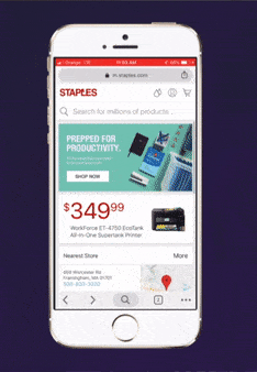
 How to get to the menu on Staples? You have no idea? Me neither. It turns out you have to tap “search” in order to get the menu. Click here to open in full size.
Mobile design is a very fine balancing act. Visitors should be able to use navigation and category options to browse without being overwhelmed and distracted by options. Space is at a premium, so every single page element needs to earn its place.
There are two points to keep in mind. First, don’t get rid of the menu icon on the basis that it clears up space and makes the user experience more pleasant. Second, don’t make the menu button ambiguous. Use an icon that visitors are accustomed to like the “triple bar” and include it near the top of the screen.
By all means, menus and icons should be simplified and streamlined to save on space, but they should never be hidden or excluded.
 What does this icon stand for? It turns out that it’s an in and toner finder – a really useful tool. But would you tap on that icon? I bet you wouldn’t!It’s not just the menu icon that needs to be clear. The meaning of all icons should be obvious to customers. Visitors won’t click on an icon if they don’t know what it means. This applies to all icons on your product and other pages.
The likelihood is that your icons lead to fantastic pages and features. If you’re selling clothing and accessories, for example, you may have a sizing chart. For retailers selling goods in bulk, there may be an icon that leads to a shipping calculator (essential for dispelling doubt about shipping prices).
Whatever the case, let people know where your icons lead with either a label or by using an obvious, well-recognized image.
 Click here to open in full size.
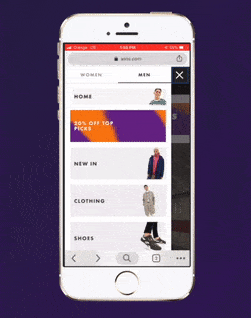
Many ecommerce stores have mobile menus that only occupy a portion of the page. The menu will either load along the right or left side of the screen.
This design has two negative consequences. First, it creates distracting background “noise” that has no practical purpose because users can’t interact with it. Second, it makes the menu difficult to interact with.
 Click here to open in full size.
One common mistake I see a lot is when users are redirected to a new page after clicking on every single menu category tab. They might hit the menu tab and select a category like “Men’s Clothes” or “Electronics”. They are then sent to a dedicated page listing the different sub-categories for each category.
This is a big mistake that adds lots of unnecessary friction to the browsing process. It prevents visitors from flipping back and forth between categories easily and adds unnecessary loading time.
Instead, when a visitor clicks on a category tab on your menu, make sure subcategory tabs load immediately. Then, when they select a sub-category, they will be taken to the appropriate page and can use the filter options to narrow down their search.
 If users want to exit the menu and return to the page they were looking at, they should be able to do so with a simple tap.
Include a big exit button – an “X” tab works well – so users aren’t in any doubt about how to close the menu. A swiping motion that closes the menu is also a good idea.

Let me reiterate the point I just made. Buttons need to be big.
Remember that on desktop users have pointers. And pointers are precise. With pointers, browsers can easily click form boxes, hover over info buttons, and click text links that are close to each other.
It’s the opposite on mobile devices. Instead of pointers, users have fingers. And fingers are clumsy.
Ensure that buttons are easy to tap with either hand. Also, reduce the possibility that they will click a nearby button by accident by leaving sufficient space between links. Visitors will often just decide to hit the giant “back button” rather than deal with a finicky link or small CTA( Call to Action).

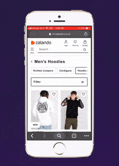
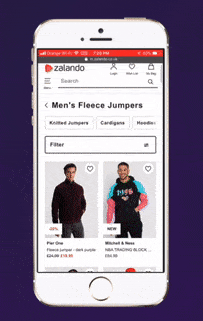
Placing two items per line strikes the perfect balance for category pages. You want to showcase as many products as possible to potential customers, thus increasing the chances of a sale, but you don’t want to make category pages too difficult to scan.
One image per line is a poor use of space, while three images per line makes it hard for browsers to pick out details and form a full impression of a product.
 Click here to open in full size.
When a user lands on a category page, they should be able to switch between further sub-categories or brands as quickly and easily as possible.
One-tap narrowing is a feature that enables visitors to quickly filter items by including sort options at the top of the page.
You can do this by including a drop-down menu – which might be more accurately described as “two-tap narrowing” – or with a side-scrolling menu along the top of the page that has options for the most popular subcategories.
 Click here to open in full size.
Ok, so let’s just recap for a moment. The ideal mobile browsing experience begins with a full-page menu that visitors can use to select categories and subcategories with ease.
Once they’ve landed on a category page, they can refine results even further with one-tap options, allowing them to see specific brands, product types, and specific subcategories.
So what about filter options for things like size, color, price, and so on?
When a user wants to set these filter options, render a full-page toplayer. It streamlines the whole process of narrowing the search down – visitors will be able to see, tap, and load the options with much greater ease.
The mobile add-to-cart rate is two times lower on mobile than desktop. The same percentage of users – around 67% – reach product pages on both mobile and desktop. But it all changes when it comes to clicking that all-important “Add-to Cart” button ? the add to cart conversion rate is 2X lower.
 Although around the same percentage of users reaches product pages on both mobile and desktop, the add to cart is two times lower on mobile in comparison to desktop ? only 4.6% in comparison to 8%.
This is partly because it’s more difficult to browse on mobile, which makes it harder for visitors to find the products they want. But it’s also due to another reason: most mobile product pages suck…big time.
So how can you improve them?

It’s crucial to remember that attention spans are limited on mobile devices. You only have a short window to persuade customers to buy.
To do this, you should hit them with the most persuasive sales elements first. Space is at a premium, so don’t put the title above the fold at the top of the page. Instead, you should show an element that’s certain to capture their attention.
Which leads nicely onto the next point…

Click here to open in full size.
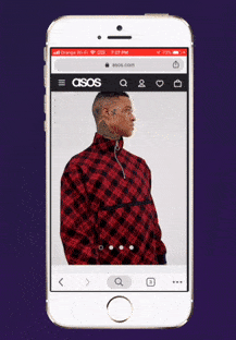
We buy primarily with our eyes, not with our minds. The title is important so customers can confirm they’re in the right place. But images do the heavy lifting.
Images recreate the experience of handling a product in a store. Just think about how you interact with an item you’re thinking about buying in a brick-and-mortar shop. You pick it up, inspect it, and perhaps check the price. You probably won’t look at the name of the product at all.
Ensure that you show high-resolution photographs with lots of details to really engage customers.
Professional photographs show the product in a positive light while giving visitors the opportunity to inspect details and features. High-quality photographs also communicate the professionalism of your brand.
 Click here to open in full size.
Once a user has seen the first photograph, they will likely want to swipe to the next one. This habit of swiping images has become automatic, likely because of Instagram, so ensure that you allow visitors to cycle through product photos with ease.
When a user wants to zoom to see a photograph more clearly, they will likely “pinch” the screen with two fingers (we can probably thank Google Maps for instilling that habit). Copy this feature for your images.

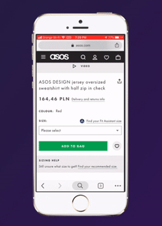
The “add-to-cart section” is the portion of your page that includes the options and information buyers need to review and change before they add a product to the cart.
It consists of the following:
In order to streamline the buying process, make sure all of the necessary information fits into a single screen. Don’t make visitors scroll back and forth to collect the details they need.

Urgency, along with its “sister emotion” scarcity, is one of the most powerful feelings an online retailer can evoke in visitors. There are few things that prompt customers to buy as effectively as urgency.
What’s more, adding urgency and scarcity-building elements to mobile product pages is relatively easy.
Here are a few proven ideas:
If you’re interested in learning more about building urgency, check out this in-depth guide that we’ve written on the topic.
 Click here to open in full size.
If you use toplayers – pop-ups that appear “on top” of the main screen – design them so that they fill the full page. Not only does this eliminate distracting background “noise”, but it also makes it easier for users to interact with the various toplayer elements.
You might use top layers for links that users can click to receive extra information about delivery, payment plans, or warranties, and so on. Whatever the case, use a full-page design.

This is a big one. CTAs that fit the size of the screen are more visible and leave visitors in no doubt about which button to click.
But, crucially, screen-wide CTAs are easier to click. Visitors are able to tap with either thumb. There’s nothing more annoying than having to switch hands when using a mobile device in order to click a CTA.
20% more users abandon checkout on mobile than on desktop. And remember, only half the amount of mobile users will have added a product to their cart in the first place!
 More people abandon their carts on mobile than on desktop.
Here’s how to ensure that number is as low as possible:

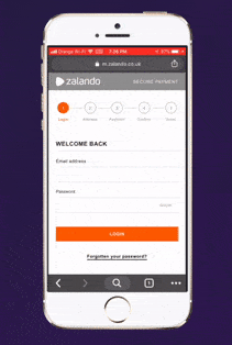
On desktop, longer checkout pages tend to work well. People are used to filling in all the necessary information in one go and clicking the buy button.
On mobile, patience and attention are limited. Instead, you should split checkout into multi-page steps, keeping customers updated about how much progress they’ve made.
 Click here to open in full size.
There’s no need to show the header and footer during checkout. During this stage of the customer journey, you should limit any “escape routes” as much as possible.

No matter how good your mobile checkout is, some visitors will still abandon their cart.
To limit this problem, collect emails before checkout starts. This gives you the ability to remarket to customers, especially with emails prompting them to complete a specific purchase, rather than lose them altogether.

How should you design your mobile checkout form for maximum success?
Here’s a checklist covering the most important points:
Make it as short as possible – Eliminate all unnecessary fields to speed up the checkout process.
Floating labels – Floating labels are small labels that appear in the corner of form fields. They make it easier for customers to check and amend any inputs.
Leverage autofill and tap index – “Autofill” enables customers to populate forms with information already saved on their phones.
Get the validation right – Let customers know if they’ve entered incorrect information straight away with a small tick or cross next to the field, rather than after they’ve hit the buy button.
Ok, so we couldn’t write an article about m-commerce optimization without mentioning site speed.
 Your mobile commerce website won’t sell until it’s blazing fast. It means that it should load in 5 seconds or less (ideally 3!).
Head over to Google PageSpeed Insights to see how fast your site is. You’ll be provided with actionable tips to improve your mobile site’s load time.
 After 3 second loadtime bounce rate soars reaching 38% by the time loadtime hits 5 seconds.
We’ve written an in-depth guide about improving your ecommerce site’s speed that you should check out.
Want to know the best way to ensure continual revenue gains? Implement a long-term testing and optimization strategy.
The top online retailers commit to testing indefinitely. They run optimization campaigns that don’t have an end-date. Instead, they continuously test changes and implement the winners.
The top online retailers commit to testing indefinitely. They run optimization campaigns that don't have an end-date. Instead, they continuously test changes and implement the winners. Click To TweetThis approach is more effective and requires fewer resources. What’s more, it completely eliminates the problems that arise when retailers opt to “rehaul” their site every couple of years without thorough testing and feedback.
We’ve created an extensive checklist filled with actionable optimization tips for all of your ecommerce pages, from your home page to your “About Us” page.
To ensure that you’ve got all your optimization bases covered, download it now for free.

💡 At Growcode, we develop and maintain online shops and B2B ecommerce on Magento!


